1) The programme front cover for the BFI Film is quite different from the traditional magazine cover as it doesn't fit the usual conventions of there being a central image, and instead the title of the publication forms the central image. The text uses straight forward language and automatically tells the audience that this booklet is a guide to the programme of the festival as it clearly states "BFI London Film Festival". The colour scheme is quite appropriate and creates a sense of professionalism, hence the use of a black background. The use of the colour red/purple also offer a boldness in contrast to the blackground. The colour scheme also links back to the logo of the progammes institution, the BFI. By placing the logo on the top left corner the rule of third comes in place as the audience is guided through the cover of the booklet. The date, from the 9th of October to the 20th links back to the idea of the progamme booklet being a guide towards the festival. The target audience then clear as we now understand that it is aimed for the festival goers. Through the use of name checks we can discover that the BFI is being sponsored by American Express, a large-scale USA bank institution, this implies that American Express is one of BFI's funders. Overall, the designers have made this programme visually interesting by making sure it doesn't fit the usual conventions of a magazine.
2)

I like the idea of using illustrations rather than the actual image for the front cover. The use of bold colours also appeals to me as it catches my eye, this suggests to me that using bold colours that also co-ordinate may be useful as it can catch the attention of the viewer.

The use of several different fonts is quite interesting as it still continues to work out. This brochure fits the more typical conventions of a magazine cover, therefore if I was to take this approach it would be appropriate if I used this layout. The fact that it is also black and white makes me feel confident on the idea that a minimalistic brochure could work.

The layout on this cover appeals to me, and the fact that the front cover is a still of the event it sets the atmosphere of a typical film theatre. The use of a still as a front cover appeals to me and I may consider doing this.
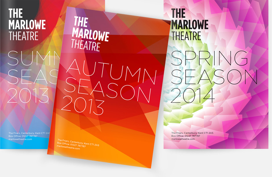
Linking my brochures cover to the atmosphere of the film may also be a good idea as shown through this brochures cover. Each cover links back to a season and I could use this idea to create a feel towards my work. I could do this by making sure the colour scheme of my cover links back to the film and the emotions it gives out.

I really like the concept of this brochure cover and hope I can use this within my own work as its one of my favourites. The cover is really simple, with there being a central image and the main focus being on the typography which is something I aim to also focus on.
3) Find at least 5 contents pages from arts programmes or magazines. How are contents pages designed? How do they use a combination of text and images to create an effective design?

With this contents page the numbers have been bunched together to create an interesting visual, as if it is a spider diagram.

This contents page is quite simplistic, and bold typography has been used, on the page besides the contents page there is a central image which links back to the theme of the magazine

This contents page incorporates image and text with the image being in the contents page and the text surrounding it . In bold is the main information on what each page is and below it are the subheadings.

This contents page links each page number with an image, it is quite simple and a typical magazine contents page

This contents page uses an image as a background. It's quite simple with each number being in bold and next to it being the contents.
No comments:
Post a Comment