Friday 15 April 2016

Completed print work


MEST 2 Evaluation

Ladan Abdulle
2,033 words
MEST 2 Evaluation
In this evaluation essay, I will be assessing the production I have produced with my team which consists of the members Sunny, Mandev, Rashida and I. During the course of this period we have produced a psychological thriller based on the lives of a group of teenagers, which eventually comes under destruction as a murder takes place within the group. Although we have chosen to base our film production on the ‘Urban Life’ topic, I believe that our film has elements of several other topics such as the intensity found in the ‘Modern-noir’ topic and aspects of the topic ‘Friendship’.

Prior to creating the extract, I decided to conduct some research into arthouse cinema and this has contributed significantly in the finalised product. I have looked into several arthouse films such as ‘Run Lola Run’ and ‘La Haine’ which have influenced our work greatly. By doing this research I had a better understanding of how we could experiment with interesting camera shots to create affective cinematography and how to play around with editing to create different moods which have been demonstrated well in the arthouse films I have mentioned. In terms of the narrative of the film, ‘Gone Girl’ and ‘Donnie Darko’ were major influences as they are both psychological films. This helped us to come up with an interesting story line that incorporated elements of the themes that run through both films. I had to also refer back to institutional research which I have also done to make sure the film corresponded to the brief. I discovered that the guideline for a 15 certificate is that no theme is prohibited; however it is more based on the frequency of specific components such as violence and strong language which creates the jump between a 15 certificate and an 18 certificate. To ensure that the film work followed the guideline of a 15 certificate I made sure that the script included some form of violence and strong language. As a group we also carried out audience research and asked our peers what their opinions were on our film idea, as they were our prime target audience in terms of age. The feedback was mostly positive with some advice given on how to create an interesting plot twist that would engage the audience a bit more. I believe that the thorough research carried out prior to starting the project was valuable as it allowed us to have a better understanding of how we wanted our film to look and this enabled us to move a step closer to creating a good quality film extract.

In terms of target audience, we aimed to secure the niche arthouse market (core audience) while also having some form of appeal towards the mainstream audience (secondary audience). The psychographic groups (Young and Rubicam) that our audience belong to vary from the explorers to the mainstreamers. The audience demographics for our film extract itself 16-25 year olds and on the lower spectrum of the social classes whereas the typical audience of an arthouse film would often be those of an ABC1 class aged 25-55 because arthouse films are quite experimental and break the boundaries compared to high budget, multiplex cinema aimed films. Therefore, an arthouse film would most likely be watched by someone who has greater knowledge of their surroundings and those who are cultured. I kept this in mind when writing the script and made sure that it was experimental and thought-provoking so it could appeal to the niche market audience. I also made sure that it would appeal to a younger audience too i.e. 16 year olds who aren’t necessarily from an ABC1 background and who do go to multiplex cinemas, by ensuring that a sense of familiarity was created between the characters and the audience. I believe that the choice of aiming an arthouse film at a mainstream younger audience while also having the traditional niche market as an audience itself is quite experimental. There are some advantages by trying to aim our film at an alternative market (mainstream audience) as our film can be an introduction into the world of arthouse cinema as it still does have the elements of a typical arthouse film. However, a disadvantage would be the idea of losing some of the niche market audience because the film may not seem ‘arthouse’ enough. Nevertheless, I believe we created a firm balance between arthouse and mainstream films.

In terms of the film extract, I believe that our arthouse film met the key conventions of a typical psychological thriller as we were able to create several moods through our filming techniques. The script itself was suitable to be classified as a psychological thriller as I made sure that the events that took place were unexpected and suspenseful such as a film of this genre would have been. The films extract ends at disequilibrium (Todorov) in contrast to the typical new equilibrium that is reached as the victim is murdered rather than being saved by a hero (Propp’s theory). When it came to the actual filming, mise-en-scene was very important as it allowed us to build onto our characters personas. For example, with the costumes we made sure the protagonist wore black clothing, as the colour black has connotations of evil. The location we used reflected onto the typical suburbs within London, which creates familiarity with the audience. We also experimented with our camera work to create an effective and artistic cinematography.  For example, the opening scene is one continuous shot that follows a character; this was an inspiration from the Copacabana shot in ‘Goodfellas’. We also used the vertigo shot, inspired by Alfred Hitchcock to keep up with the creativity which is a basis for arthouse filming. The vertigo shot was useful as it contributed to creating the unsettling scene we were aiming for. The P.O.V shot was also vital to portray the scene from the view of our characters; this allowed the audience to get an insight into the characters emotions and thoughts which therefore allowed us to show the antagonist’s dysfunctional mind. With the editing, we used different filters such as a light blue filter to create an atmosphere which has connotations of isolation; this was useful for the murder scene in the woods as it created a tense atmosphere. A time lapse was also included as a transition to imply movement of the characters from one scene to another rather than just cutting to the next scene. With the sound, we used alternative indie music to link back to the arthouse theme rather than mainstream music for the opening scene. I believe we were quite successful with our filming; however we could have improved upon it by having more professional props. Nevertheless, arthouse films are mostly low-budget and for the sake of artistic visuals therefore it can be justified. 
Several audience pleasures (uses and gratifications, Katz and Blumler) can be provided to the audience through watching our film extract. For example, the target audience can have a sense of familiarity towards the characters because they know what it is like being in a friendship group and hanging out therefore they can see themselves reflected within the film, especially with the location being an urban London suburb. The audience can also experience forms of escapism as they experience entertainment. For the older middle class audience they can be educated, as they can see what the typical lives of teenagers are in a London suburb (apart from the murder). Overall, I believe that filming our film extract went quite well.

Within the representation aspects of the film extract, our cast consisted of ethnic minorities. The use of ethnic minorities for characters such as the protagonist who is Asian, defied the idea of the majority of roles being played by Caucasians. The fact that all the characters are teenagers immediately creates a negative image of them as teenagers are often assumed to be ‘getting up to no good’, which can be linked back to Medhurst’s theory of shorthand identification. In terms of gender representation, the victim is female and the typical representation of females being vulnerable victims is reinforced in contrast to the protagonist who carries masculine and powerful traits. With the protagonist, we created an alternative image of teenagers as the protagonist is represented as being mentally unstable and dysfunctional, which is quite a plot twist as he comes across as being charismatic and normal while still carrying his masculine traits of power and authority over others. This however only reinforces the negative image of teenagers unfortunately, but to a point where his murderous actions are unexpected.

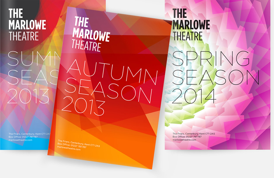
With my print work, I aimed to match the key conventions of a typical arts centre/cinema brochure by applying my research skills into brochures such as the BFI’s to reproduce a professional product. For example, I have found that a majority of brochures use bold colours and follow a scheme throughout which I have applied to my own work by making sure the colour scheme and font were consistent. I believe that my contents page was particularly detailed as I created a geometric outline for my image (Image 2) which I then layered to create the effect it has. The use of different font sizes for the pages and the subheadings was an inspiration from a magazine. I followed the conventions of a typical double page spread for my version and wrote in column sections. To make my spread have a modernised theme I used quotation brackets to give my quotes a cleaner look (image 3), the use of bold italics was a useful feature I found on Photoshop because it made the subheadings seem edgier. The use of sponsorship logos and social media links gave my front cover a sense of legitimacy.  Perhaps I could have improved on my print work by using a fuller image for the front cover (image 1) to fill up the page a bit more, however I do believe that the current image gives it a simplistic and clean look and allows the texts to be readable.

If I had done the third brief I would have created an online film blog that fitted the theme of the film in terms of appearance, and it would be regularly updated with content such as behind-the-scenes and also some form of user-generated content to engage the audience. I would have used social media and viral marketing such as Ben Drew did with his ‘Ill Manors’ campaign as a strategy to creatively drive visitors to my film blog because much of today’s society is on some form of popular social media. It is also much more efficient and cheaper than running a website or using billboards.  By doing this, a larger audience would be exposed to the film and information of the film would be spread more quickly.

If the film extract was to be extended into an actual feature length film, I would aim for there to be some form of cross-promotion with other institutions, such as the arthouse film ‘A Field in England’. By releasing the film across all forms of media platforms i.e. TV, VOD, and at cinemas on the same day, the film will gain recognition thus increasing the audience interest, such as Ben Wheatley has done. This would also create synergy with each platform, while also allowing each platform to have its own addition benefits i.e. extras/behind the scene on DVD’s. I believe this is a successful strategy as releasing the film across all platforms will bring in a wider audience and will push each platform toits ultimate advantage

Overall, I believe as a group we have met the original brief quite well for our film work as we incorporated different styles and techniques to make sure our film was experimental and captivating. If the film product were to be put into the media market place it would be quite successful as it would appeal to two audiences, arthouse and mainstream. In conclusion, I believe we worked well as a team to produce a good quality film extract that would be suitable to be exhibited at an arthouse cinema.


Thursday 11 February 2016

BFI notes

The Types of Theatrical Distribution:

  • Art house cinemas: The  BFI and independent cinemas such as Electric Cinema. They usually exhibit low budget films
  • Multiplex cinemas: These are arge cinema chains such as Vue & Odeon 
  • Prestige: These are cross-overs of both, they are low budget films with big actors. 

Institutions

Vertigo: 
  • Formed in 2002 for the purpose of distributing 2 short films. 
  • They avoid producing prestige films
  • Partners with Syco (Simon Cowells comapany) 
  • Vertigo tends to hide its low budget
Warp: 
  • Formed in 2001 and started off as an electronic music label which supported challenging and experimental music
  • It is a middle ground between arthouse and multiplex 
  • In partnership with Film Four 
  • Warp uses its low budget to inspire creative freedom. 

Uses and Gratifications for national audience?

  • Information/Education: How do other British people live? What are the issues affecting the UK?
  • Social Interaction: 'Crowd Pleasures' (social viewing), Oscar nominations (conversation point)
  • Personal Identification: National pride, solidarity,aspiration, glamorization,reinforcing/rejecting values
  • Pure Entertainment: Spectacle, escapism, adrenaline (thriller/horror), catharsis (+emotional intensity)

Uses and Gratifications for US/international audience?
  • Information/Education: historical/literary figures,contemporary celebrities/royalty
  • Social Interaction:'Crowd pleasures' (social viewing, Oscar nominations (conversation point)
  • Personal Identification: Solidarity with subcultures/marginalized groups rarely represented in mainstream cinema 
  • Pure Entertainment: spectacle, escapism, adrenaline (thriller/horror), catharsis (+emotional intensity)

United 93 Review

United 93 is a very gripping and heart-breaking film in terms of the story line and the concept, which is based on the plane United Airlines flight which was hijacked by al-Qaeda on September 11, 2001. The fact that it is based on a true story makes the audience feel great sympathy for those who suffered, as the film revolves around those who tried to regain control of the plane which eventually crashed into a field killing all onboard. The film has no political views, but rather relives the final 90 minutes of the ill-fated passengers and this film can be seen as a form of raising awareness on this event.

In terms of cinematography the film is completely shot with hand-held cameras, this only emphasises the natural feel of the film and makes it seem more like a documentary and there is a sense of realism when watch it. I believe the cinematography of this film is quite good as most of the shots are able to capture the emotions and gestures of the characters, which can give out a lot of information in a short space of time, this adds onto the tension of the film. The editing of the film i.e. fast-paced editing also adds onto the impact it has on the audience as fear and chaos are clearly represented.  The use of sorrowful music during certain parts of the film i.e. when passengers make calls to their relatives adds onto the distressing atmosphere of the film

The mise-en-scene is also quite important. For example, the cast are quite diverse from children, adults and foreigners to portray the terrorists. This adds onto the sense of realism as the diversity of passengers on a plane is represented through the cast they have chosen, and the fact that foreigners have been used to portray the terrorists adds onto this realism of the event and the stereotypes that are now part of society (foreigners are evil, dangerous). The setting is a recreation of the plane, which also adds onto the realism.


Overall, the director was quite successful with this film, and the fact that it is based on a true story only adds onto the sympathy the audience has for these passengers while also raising awareness on the gravity of this fateful event. 

Thursday 21 January 2016

Work completed since 6 January

Work completed since 6 January

  • Mise en scene, locations, costume, props, casting, cinematography/visuals
  • Redraft of script, shot list and storyboard 

Any incomplete pre-production tasks?

  • None, all pre-production tasks have been completed

Next steps/Action plan

  • Photoshoot on 27th Jan
  • Location filming, e.g. establishing shots etc
  • Getting a soundtrack sorted
  • Getting props and costumes sorted

Date filming will be complete?

  • Unknown yet

Requirements for photoshoot next week

  • Characters/Subjects needed for photoshoot are available and able to come
  • Costumes and props need to be sorted (e.g blood/murder weapon)

Double page spread feature

REPRESENTATIONS
-THE CHARACTERS IN DETAIL FROM THE WRITER OF TRANSGRESSION


Bold, intense and deeply ominous, these are just a few words that could describe the thrilling narrative of TRANSGRESSION. This couldn't have been achieved without the mesmiring characters and their persona's played by our skilled actors. 

As the writer of the script, I decided to get a bit creative with characters and paid attention to all details from their clothing to their dialogue to make sure that a certain representation is given out towards the audience so they could get an understanding of each character. 

The main protagonist, Jason, who is the killer, has a manipulative characteristic which he hides through his charisma and charm, it could almost be argued that he’s mentally unstable. He desires power and attention, something which he lacked before he brutally murdered a vulnerable friend, Grace. His killing gave him a sense of superiority, but it also adds onto his paranoia. He faces several conflicts such as one member of their friendship group, Lucia, gets suspicious about his sudden change in personality, as the lies he makes increase and increase. Jason’s also has a very rough and not caring look to his attire. His dark clothing links back to the negative connotations associated with dark colours i.e. evil, danger. His lack of care is therefore represented through his clothing, and this foreshadows the lack of compassion he will have towards Grace when he murders her. Jason’s characteristics defy the typical characteristics of an average male teenager hence the sudden plot twist; his pathetic intentions to kill the most defenceless character takes all sympathies and admiration created by the audience for him away.

Even the smaller details such as the names also went into account, such as Grace’s name. Her name links back to the overall persona of her character, one of goodness and courtesy. The fact that Grace also wears white links back to her representation of being ethereal and naive. The colour white has positive connotations and is often related to innocence and goodness which Jason stains .i.e the blood/mud stained clothes by corrupting her and killing her.

Lucia’s character plays a major role as she is the only character who gets suspicious of Jason’s intentions. She is quite reserved and laid back but pays attention to surroundings in quite a lot of detail. In her dialogue she constantly criticises Jason, which suggests to the audience she is quite hard to please, but this also emphasises on her sharp mind as she clearly knows something is up, however this is unfortunately dismissed. 

All in all, TRANSGRESSION wouldn't have been as captivating as it was if it wasn't for the entire crew and actors who contributed greatly towards the production of the film. 

Tuesday 19 January 2016

Planning and sketching


1) All the things my target audience might be interested in: 

Film Genre


  • Modern noir in terms of the crime element.
  • Horror's, thrillers
  • Urban Life in terms of the typical conventions of teenagers living in the suburbs. 

The subject itself: 

  • Dealing with friendship issues
  • The psychological element, how many people are mentally disturbed yet we are unaware. Are they getting the help they need? 
  • How teenagers are represented in society
  • Why we chose to revolve the film around the lives of teenagers in the suburbs rather than it being a typical modern noir. 
2)


3)


The contents page will also be quite simplistic, with stills from the images or a faded image of the protagonist in the background.

4-5)

Modern Representations in Society
  • The Characters and representations
The Concept
  • Why we chose to Revolve the Film around the Lives of Dysfunction Teenagers. 

Research


1) The programme front cover for the BFI Film is quite different from the traditional magazine cover as it doesn't fit the usual conventions of there being a central image, and instead the title of the publication forms the central image. The text uses straight forward language and automatically tells the audience that this booklet is a guide to the programme of the festival as it clearly states "BFI London Film Festival". The colour scheme is quite appropriate and creates a sense of professionalism, hence the use of a black background. The use of the colour red/purple also offer a boldness in contrast to the blackground. The colour scheme also links back to the logo of the progammes institution, the BFI. By placing the logo on the top left corner the rule of third comes in place as the audience is guided through the cover of the booklet. The date, from the 9th of October to the 20th links back to the idea of the progamme booklet being a guide towards the festival. The target audience then clear as we now understand that it is aimed for the festival goers. Through the use of name checks we can discover that the BFI is being sponsored by American Express, a large-scale USA bank institution, this implies that American Express is one of BFI's funders. Overall, the designers have made this programme visually interesting by making sure it doesn't fit the usual conventions of a magazine.


2)  

I like the idea of using illustrations rather than the actual image for the front cover. The use of bold colours also appeals to me as it catches my eye, this suggests to me that using bold colours that also co-ordinate may be useful as it can catch the attention of the viewer. 


The use of several different fonts is quite interesting as it still continues to work out. This brochure fits the more typical conventions of a magazine cover, therefore if I was to take this approach it would be appropriate if I used this layout. The fact that it is also black and white makes me feel confident on the idea that a minimalistic brochure could work.


The layout on this cover appeals to me, and the fact that the front cover is  a still of the event it sets the atmosphere of a typical film theatre. The use of a still as a front cover appeals to me and I may consider doing this. 


Linking my brochures cover to the atmosphere of the film may also be a good idea as shown through this brochures cover. Each cover links back to a season and I could use this idea to create a feel towards my work. I could do this by making sure the colour scheme of my cover links back to the film and the emotions it gives out. 


 I really like the concept of this brochure cover and hope I can use this within my own work as its one of my favourites. The cover is really simple, with there being a central image and the main focus being on the typography which is something I aim to also focus on.


3) Find at least 5 contents pages from arts programmes or magazines. How are contents pages designed? How do they use a combination of text and images to create an effective design?

With this contents page the numbers have been bunched together to create an interesting visual, as if it is a spider diagram.


This contents page is quite simplistic, and bold typography has been used, on the page besides the contents page there is a central image which links back to the theme of the magazine 


This contents page incorporates image and text with the image being in the contents page and the text surrounding it . In bold is the main information on what each page is and below it are the subheadings. 

This contents page links each page number with an image, it is quite simple and a typical magazine contents page 


This contents page uses an image as a background. It's quite simple with each number being in bold and next to it being the contents.


Friday 15 January 2016

Photoshoot planning

Photoshoot

1) The main characters that will appear on the front cover of my programme will most likely be either Grace or Jason as they are the protagonists. I aim for the cover page to be quite artistic, therefore when it comes to shooting the photos I will have to consider the lighting and when it comes to editing I will have to make sure it stands out by for example choosing appropriate typography and creating enigma codes through text. 


2)
For the contents page I hope to use stills from the actual production without giving away too much information. By using stills each image can be linked to a specific page and give a brief idea of what the completed film may look like etc.

3) The images on the double will be of the cast, I may also do a Directors/group note section so I may have to also take pictures of Sunny and our group during the photoshoot. I will also do another small section on the characters and their representations/other information on another page.


4)Shot list for the photoshoot:


  • Medium shots of Grace and Jason together
  • Low angles/high angles to show superiority/ inferiority 
  • Shots of Jason 
  • Medium shots of the entire cast (This will be done during the filming period)

Props: 
  • The baseball bat
I also have to make sure that each character brings their own costumes, such as Grace bringing white clothing to represent her goodness/purity and Jason bringing casual baggy clothing (preferably dark clothing) 

6) I will make sure I have everything prepared for the photoshoot by ensuring that the characters I need are free during the day or afterschool, I'll also have to bring in the props 

Wednesday 13 January 2016

Re-Drafted work

New Shot List


SHOT LIST: TRANSGRESSION

SHOT NO.
SHOT
FILMED?
1
Establishing shot of location

2
Medium long shot of the teenagers

3
Medium shot of Jason

4
Close up of the bottle

5
Tracking as he puts the bottle in the middle

6
Low angle of the bottle spinning until it stops

7
Medium shot/tilt up to Jason speaking again, then reaching to spin it again

8
Pan to Lucia who stops it from spinning

9
Shot reverse shot of Lucia

10
Shot reverse shot of Devon

11
Medium shot of Devon and Lucia

12
Medium shot of Grace

13
Over the shoulder shot of Grace towards Jason

14
Shot reverse shot of Tyra

15
Shot reverse shot of Lucia

16
Over the shoulder of Lucia, focus shifts onto Jason

17
High angle of the bottle spinning (Birds eye view)

18
P.O.V of the bottle as it continues to spin/ slow down

19
Medium shot of everyone as the bottle comes to a halt

20
Medium shot of Lucia

21
Medium shot of Tyra

22
Cut to medium tracking shot of Jason

23
Match on action close up of jason offering his hand

24
High angle, medium close up of Grace looking up

25
Match on action of grace taking his hand

26
Medium shot of them together

27
Shot reverse shot of Lucia and Devon

28
Medium shot of Lucia

29
Establishing shot of the sky, the trees

30
Dissolve into medium shot behind Grace and Jason walking together

31
Close up of his hands slowly reaching for hers

32
Medium close up of Graces expression

33
Medium close up of Jason

34
Back to close up of hands as he lets go

35
Medium shot of Grace and Jason continuing to walk separately now

36
Medium long shot as Jason is seen slowing down

37
Medium shot of Grace still walking

38
Over the shoulder of Jason

39
Long shot of Grace as she continues to walk

40
Vertigo shot as she turns around

41
Medium shot behind Jason of him choke holding her

42
High angle of Grace on the ground

43
P.O.V Low angle of Jason

44
Match on action as he reaches for the bat

45
Long shot of him beating her to death in the distance, tossing the bat away

46
Low angle of his shoes kicking her limp body, starting to walk away

47
Zoom out as he walks away

48
Dissolve of different shots as he continues to walk further away


Mise en scene 

Cinematography/Inspirations

Gone Girl, in terms of the mentally disturbed protagonist and the general psychological .


In terms of cinematography and actual filming styles:


House of Cards, different depths and variety of things being in focus/ out focus, foreground/background etc

Whiplash, use of colours and palettes
Drive, use of colours and palettes, and general cinematography, possible use of soundtrack
Run Lola Run, use of solid colour tint overlays which helps to drive the narrative and multiple personality or narratives of characters.
Trance, use of editing in post production to create disorientating effects etc
Edgar Wright (Scott Pilgrim, Hot Fuzz), possible use of the "montage" stylised cutting of scenes.

Casting


The characters with the most focus during the 3 minute extract will be Grace and Jason. Atousa will be playing Grace. Izaaz will be playing Jason. Lucia, Tyra and Devon will be played by 


Locations


A quiet and reserved area such as the woods near a park will be needed for the scene where Jason kills Grace. Another area where the entire location looks abandoned and old will be used for where the teenagers are hanging out.


Props


The props needed are a baseball bat which could be substituted later if we don't find one. Also a bottle will be needed as it is the central part of story line. 


Possible props, cigarettes, beer/alcohol containers?


Costume and Make up


Normal clothing because the characters are all teenagers, make up will be needed for the violence and the blood when Grace is killed.


Jason - Typical guy outfit (jeans, t shirt, hoodie, trainers) extremely casual almost bordering on the sense of lazy. Generally needs to have a very "rugged" and not caring look to his attire. This generally to show the idea of how he reflects himself as disorganised and unlike normal stylish guys.

Devin - A bit more stylish but also casual, shows his a lot more trendy and generically up beat personality. He's a lot more of a laid back but cultured guy and likes to show it.

Lucia - Fashionable and trendy attire, as she's considered and seen by her peers as a "popular girl". This has to be portrayed appropriately through her costume. It must still hold to the casual theme of teenagers.

Grace - She's a lot more of a shy and reserved girl who doesn't care too much about how she presents herself. She still wants to look good so that she can fit in with her peers and so tries her best to reflect her personality of being a nice and shy person through her costume. 

Tyra - Laid back and but generally a much more perspective person who isn't easily fooled. She's shown as very casual and chilled. Use of hoodies would be good to show this and matched with trainers and t shirts.

Lighting


Generally, we will use natural day lighting but can use some high key lighting to create dramatic emphasis if need be. Lighting will have to be essential to create a vivid colour palette that resembles an indie film such as Drive.


New Storyboards


Schedule